
Image used with permission from Håkan Forss (https://hakanforss.wordpress.com/) who’s talk at Lean Agile Scotland in 2013 has stuck with me, given me some of the means to articulate these ides, and started me on the road to this post.
Being ‘Too busy to improve’ is something we all tend to bump into now and again. Where the amount of daily “busy” work feels like it’s taking over, there’s no space left to think about changes or improve things, and any mention of doing something new comes up against so much friction that it grinds to a halt before it begins. So what can be done to get unstuck, and start making progress?
Recently we changed the structure of the Tech department and I found myself looking after a new, dedicated security team and in this exact position. We have a lot of operational controls to perform, alerts to investigate, a roadmap of projects, and not a lot of people. The controls and investigations felt like they were taking up all our time, and that was preventing us from getting on with the projects that are needed to take us to the point where we’re adding value instead of just staying busy.
With this new structure, I wanted to take the opportunity to do something to make sense of where we are, challenge some assumptions, and gather some useful data, all to help move us forward:
- Understand all the tasks we perform and how much time they take up
- Understand the maturity of the tasks and what could be quickly improved
- See where our gaps were
- Challenge some perceptions
To do this, partly inspired by this great post from Chris McDermott and others, I decided to try something based on a sense making framework called Cynefin which I’d seen in plenty of presentations but hadn’t had a chance to try out. And it worked! After a couple of hours, we had a shared view on roughly how much time was spent on these tasks, we’d identified a number of tasks that could be done much more quickly with some thought and minor changes, and found some blind spots that needed to be dealt with
Understanding our work better
Before getting together, we collected details about all the tasks we performed: Dashboards that were checked, reports reviewed, alerts analysed, and logs looked at. Any controls performed that kept us busy and anything that we weren’t doing that we knew we should.
The first thing we did was to ‘t-shirt size’ the tasks, not a perfect method but good enough in the absence of any real data, and group together things where the effort overlapped. We used Small, Medium, Large, and XLarge, which translated roughly to 5/10/15/30 mins. We could discuss them in context “is X really the same size as Y?” and get a reasonable, shared view on the effort required. Once we had an idea for each task, we looked at it all as a whole and agreed it sounded about right.
We learned we spent roughly half our daily capacity just on these tasks, adding in investigating alerts and the cost of context switching meant that we could see that we were busy but did have little time left for project work.Knowing roughly how much meant we could better plan for using it, carving out time to make it happen.
Finding the gaps
Another quick check we could do, is comparing these tasks to the CIS Top 20 controls. Again, not a perfect method, but having just discussed all the controls we do, we could quickly run through these 20 high level statements, mark the controls that the task contributed to, and agree where we didn’t have enough in place.
If we’d had more time, we might have done this part differently, using the sub controls or benchmarks for specific systems, or even a different set of standards as a starting point. The goal here was to identify high level problems to solve or projects to put on a roadmap, rather than coming up with solutions.
Making sense of it all
Now we could use the Cynefin-inspired approach to make sense of things. Very briefly, Cynefin splits problems into 5 domains: Obvious and Complicated are considered Ordered, where relationships between things (cause and effect) are predictable; Complex and Chaotic are Unordered, where these relationships can only be understood in hindsight; and lastly Disorder for when it’s unclear what domain you’re in.
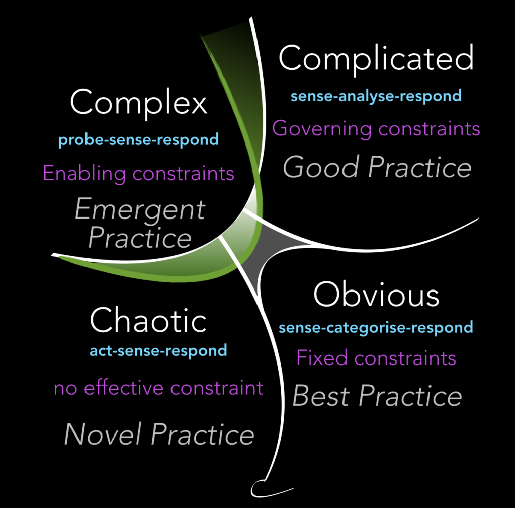
For this, I decided that Ordered meant we knew what we were looking for, and Unordered was when we were looking at something without a clear idea.
Ordered could be further split into Automated and Manual categories, separating those situations where a decision is made automatically from decisions made by an expert.
On the Unordered side, this covers the ‘we know it when we see it’ situations of looking through large log files or dashboards full of line graphs, where we either have the data, the means of reviewing it, and an idea of what to look for within it, or we lacked at least one of those.
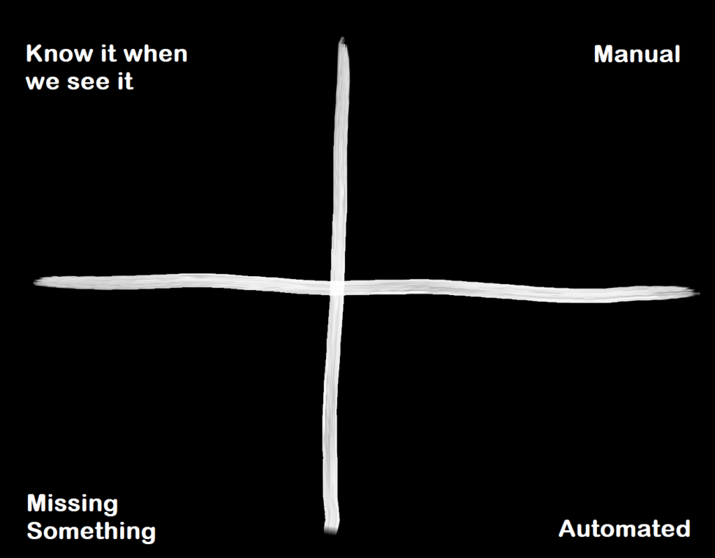
I drew this structure up on the wall, and each of the tasks was written on a post it note and placed in the section that most suited it. At Agile Scotland in December 2018 I heard Liz Keogh talk about the Four Point Contextualisation method, I’d be interesting in trying this instead if I was running the session again, we just sorted rather than trying to find more specific context between tasks, however we did find that we naturally put some things closer to certain boundaries, mirroring the Liminal boundary addition to the Cynefin framework from 2017.
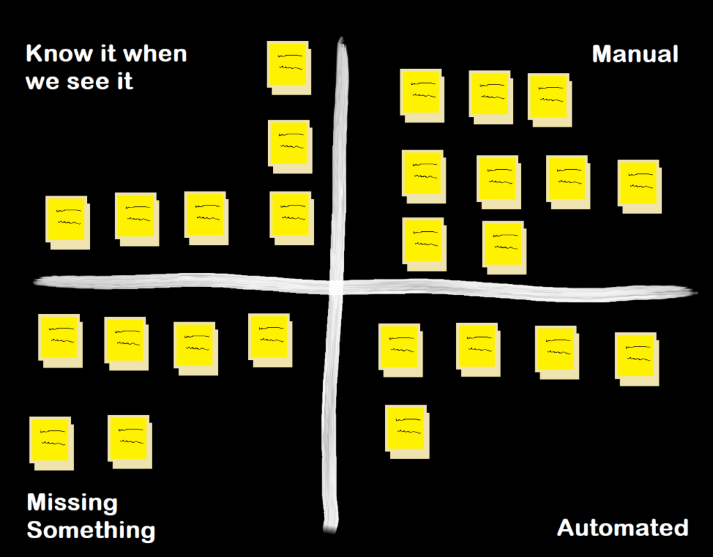
How did we use this information?
This gave a rough indicator of how mature each of our controls were.
The items in the bottom left are all gaps/blind spots, we could look at these to work out what needed to be addressed as a priority based on the value of the system it covered. As we were possibly lacking some key element for these, there’s a chance they could require some reasonably chunky change to get things started, so some might not be addressable quickly, but we had enough information on risks and costs to influence our plans.
Next we could look at the top left and pull out some that could quickly be improved, either by identifying patterns to alert on, or at least find ways to speed up the manual checks, saving us 10-20 minutes per task each day.
In the top right, we could see which tasks were candidates to be automated, as emails or alerts to Slack, etc. to cut down on context switching time.
In the bottom right we could look at the automated alerts and consider whether they were still effective/necessary or were leading to investigations (that are costly in terms of time) that turned out to be false positives.
Wrapping up
Now we had a number of options to reduce the amount of time overall spent on these tasks, a better idea of how they contributed to the overall security requirements, and a list of projects to improve the coverage & effectiveness of the controls. Everyone had a better idea of what capacity we truly had, and came out more energised, having a clear view on the way forward
A lot of the value came from the discussions, this process gave a shape, and we need to make sure we follow up buy using this information in planning sessions and capacity management. One clear benefit straight away is how this has improved our documentation. All the information that emerged on why we do something, where the data comes from, how it’s measured, and how to act on an alert, has been documented and kept up to date, helping us maintain the level of clarity we gained in this discussion..
There are a number things I’d change if I ran this again, and I’m conscious it’s not a particularly scientific method, but it was certainly useful enough to achieve what I hoped for and we’ve been able to keep parts of it going by using the language used here in our discussions since then.
Leave a Reply